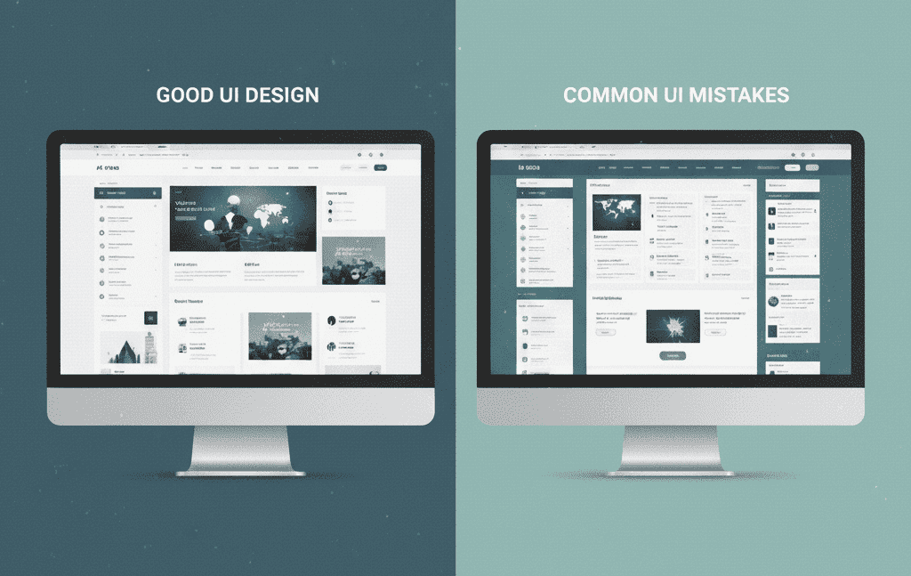
Creating a website that converts visitors into customers isn't just about having great content—it's about delivering an exceptional user experience. Unfortunately, many websites suffer from common design mistakes that drive users away before they even get a chance to engage with your content.
After analyzing thousands of websites and working with countless developers at Themedevhub, we've identified the 10 most critical web design mistakes that kill user experience. More importantly, we'll show you exactly how to fix them.
1. Slow Loading Times
The Mistake: Your website takes more than 3 seconds to load, causing users to bounce before they see your content.
Why It Kills UX: Studies show that 53% of mobile users abandon sites that take longer than 3 seconds to load. Every additional second of loading time can reduce conversions by up to 7%.
How to Fix It:
- Optimize images using modern formats like WebP
- Minimize HTTP requests by combining CSS and JS files
- Use a Content Delivery Network (CDN)
- Implement lazy loading for images and videos
- Choose lightweight, optimized themes
Themedevhub Solution: Our performance-optimized templates are built with speed in mind, featuring optimized code, compressed assets, and modern loading techniques that ensure your site loads in under 2 seconds.
2. Poor Mobile Responsiveness
The Mistake: Your website doesn't adapt properly to different screen sizes, creating a frustrating mobile experience.
Why It Kills UX: With over 60% of web traffic coming from mobile devices, a non-responsive design alienates more than half your audience. Google also penalizes non-mobile-friendly sites in search rankings.
How to Fix It:
- Use CSS Grid and Flexbox for flexible layouts
- Implement mobile-first design approach
- Test on multiple devices and screen sizes
- Ensure touch targets are at least 44px in size
- Use responsive typography with relative units
Themedevhub Solution: All our responsive UI components are built mobile-first and tested across 15+ devices. Simply copy-paste our responsive navigation bars, cards, and layouts to ensure perfect mobile experience.
3. Confusing Navigation Structure
The Mistake: Users can't find what they're looking for because your navigation is unclear, buried, or overly complex.
Why It Kills UX: If users can't navigate your site intuitively, they'll leave. Poor navigation increases bounce rates and reduces time on site, signaling to search engines that your content isn't valuable.
How to Fix It:
- Keep main navigation to 7 items or fewer
- Use clear, descriptive labels instead of creative terms
- Implement breadcrumbs for deeper pages
- Add a search function for content-heavy sites
- Use consistent navigation across all pages
Themedevhub Solution: Our navigation component library includes proven navigation patterns like mega menus, sidebar navigation, and mobile hamburger menus that users already understand and expect.
4. Overwhelming or Cluttered Design
The Mistake: Cramming too much information, too many colors, or too many elements onto a single page.
Why It Kills UX: Cluttered designs create cognitive overload, making it difficult for users to focus on what's important. This leads to decision paralysis and higher bounce rates.
How to Fix It:
- Embrace white space to let content breathe
- Follow the 80/20 rule: 80% white space, 20% content
- Use a maximum of 3 primary colors
- Group related elements together
- Prioritize content hierarchy with typography
Themedevhub Solution: Our clean, minimalist templates follow proven design principles with optimal white space usage and clear visual hierarchy, helping you create professional layouts without the guesswork.
5. Weak Call-to-Action (CTA) Buttons
The Mistake: Your CTA buttons are hard to find, use weak language, or don't stand out visually from the rest of your design.
Why It Kills UX: Weak CTAs fail to guide users toward desired actions, resulting in lower conversion rates and missed business opportunities.
How to Fix It:
- Use action-oriented language ("Get Started," "Download Now")
- Make buttons visually prominent with contrasting colors
- Place CTAs above the fold and at logical points in content
- Use urgency when appropriate ("Limited Time," "Join 10,000+ Users")
- A/B test different button colors and text
Themedevhub Solution: Our CTA button collection includes high-converting button designs with hover effects, loading states, and proven color combinations that drive action.
6. Poor Typography and Readability
The Mistake: Using fonts that are too small, low contrast text, or decorative fonts for body content.
Why It Kills UX: If users can't easily read your content, they won't stay to consume it. Poor typography creates accessibility issues and frustrates users across all devices.
How to Fix It:
- Use minimum 16px font size for body text
- Ensure sufficient contrast (4.5:1 ratio minimum)
- Limit to 2-3 font families maximum
- Use proper line spacing (1.4-1.6 line height)
- Choose web-safe fonts or reliable web fonts
7. Missing or Ineffective Loading States
The Mistake: Not providing visual feedback when users perform actions like submitting forms, loading content, or navigating between pages.
Why It Kills UX: Users need feedback to understand that their actions are being processed. Without loading indicators, users may think the site is broken or click multiple times, causing errors.
How to Fix It:
- Add loading spinners for form submissions
- Use skeleton screens for content loading
- Implement progress bars for multi-step processes
- Show success/error messages after actions
- Use smooth transitions between states
Themedevhub Solution: Our CSS loader collection offers 250+ lightweight, customizable loading animations that you can implement with just copy-paste no JavaScript required.
8. Broken or Inconsistent User Interface
The Mistake: Inconsistent button styles, mixed design patterns, broken layouts, or elements that don't work as expected.
Why It Kills UX: Inconsistency creates confusion and makes your site feel unprofessional. Broken elements frustrate users and damage trust in your brand.
How to Fix It:
- Create and follow a design system
- Use consistent spacing, colors, and typography
- Test all interactive elements regularly
- Maintain consistent navigation patterns
- Document design standards for your team
Themedevhub Solution: Our complete UI component library ensures consistency with matching styles across buttons, forms, cards, and navigation elements—all following the same design system.
9. Ignoring Accessibility Standards
The Mistake: Not considering users with disabilities by missing alt text, poor color contrast, or keyboard navigation issues.
Why It Kills UX: Accessibility isn't just about compliance—it's about creating inclusive experiences. Poor accessibility excludes users and can result in legal issues.
How to Fix It:
- Add descriptive alt text to all images
- Ensure keyboard navigation works throughout the site
- Use semantic HTML elements properly
- Provide sufficient color contrast
- Include focus indicators for interactive elements
10. Lack of Clear Value Proposition
The Mistake: Visitors can't quickly understand what you offer, why it matters, or how it benefits them.
Why It Kills UX: If users don't immediately understand your value, they'll leave to find a competitor who communicates more clearly. You have about 8 seconds to capture attention.
How to Fix It:
- Create a clear, benefit-focused headline
- Use subheadings to elaborate on your value
- Include social proof (testimonials, logos, numbers)
- Show, don't just tell (use visuals and examples)
- Place your value proposition above the fold
Themedevhub Solution: Our landing page templates are designed with conversion in mind, featuring proven layouts that clearly communicate value propositions and guide users toward action.
Conclusion: Building Better User Experiences
Avoiding these 10 common web design mistakes will dramatically improve your user experience and conversion rates. The key is to always think from your user's perspective: Is your site fast? Is it easy to navigate? Can users quickly understand what you offer?
Remember, great UX design isn't about following trends—it's about solving user problems efficiently and elegantly.
Ready to fix these mistakes on your website? Explore Themedevhub's collection of optimized templates and components to implement these solutions quickly and professionally. Our ready-made components are designed to avoid these common pitfalls while delivering exceptional user experiences.
Want more web design tips and resources? Follow Themedevhub for regular updates on modern web development practices and free UI components.