Stylish CSS Switches Collection
Browse customizable CSS switches and toggles. Adjust size, color, and style, then copy the code to enhance your projects.
Comments
Sign in to leave a comment
No comments yet. Be the first to comment!
Similar Coding Tools
Supercharge your productivity with these powerful coding tools. Streamline your workflow and save time with our curated collection.

Pattern Craft Collection
Browse a handcrafted collection of ready-to-use CSS background patterns. Instantly preview and copy the styles to use in your next project.

CSS Checkbox Collection
Quickly design custom CSS checkboxes with unique styles, colors, and animations, ready to integrate into your web projects.

Markdown to HTML Converter
Instantly convert Markdown content into clean, valid HTML.

CSS Loader Collection
Easily create animated CSS loaders and spinners with custom colors and styles, ready to use in your projects.

CSS Box Shadow Generator
Generate beautiful CSS box shadows with adjustable blur, spread, and color options, ready to copy and use in your designs.

Tailwind Grid Generator
Generate responsive grid layouts with Tailwind CSS.

CSS Button Collection
A complete set of buttons and menu buttons built with CSS and Tailwind.
What is CSS Switches Collection?
CSS Switches Collection is a curated library of beautifully designed toggle switches built using pure HTML and CSS. These interactive toggles replace boring browser checkboxes with modern, stylish switches that instantly make any user interface more engaging and intuitive.
Toggle switches are now a standard UI element in modern websites and apps. They are widely used for features like dark mode, notification controls, privacy settings, and more. With this collection, developers and designers can easily add professional-grade CSS switches without writing JavaScript or depending on bulky UI frameworks.
Every switch in this collection is lightweight, responsive, and fully customizable. Whether you’re working on an admin dashboard, a mobile-first web app, or a personal website, these CSS toggle switches will instantly enhance usability while giving your project a polished, modern look.
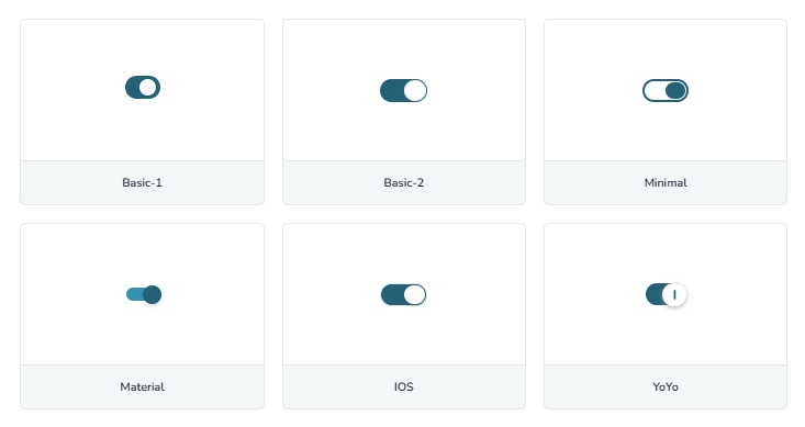
Types of CSS Switches
The collection includes multiple styles and variations of switches so you can pick the one that best suits your project’s UI/UX design:
- iOS-style Switches – Minimal, rounded sliders inspired by Apple’s iconic design.
- Material Design Switches – Clean toggles based on Google’s Material Design language.
- Neon Glow Switches – Bold glowing switches perfect for gaming and creative websites.
- Minimalist Switches – Flat, distraction-free toggles that fit modern dashboards.
- 3D & Skeuomorphic Switches – Realistic designs with depth, shadows, and textures.
Why Use CSS Switches Collection?
Switches are not just design elements — they improve both usability and accessibility. Here’s why developers love toggle switches from this collection:
- Clear ON/OFF states that users can understand at a glance.
- Larger, mobile-friendly tap targets compared to standard checkboxes.
- Fully accessible with screen readers and keyboard navigation.
- 100% pure CSS implementation — no JavaScript required.
- Ideal for dark mode toggles, notifications, feature controls, and more.
Switch Styles You Can Create
From sleek and minimal to bold and glowing, this collection lets you create and customize the perfect switch for your project. Choose a ready-made design or tweak the colors, size, and animation speed to match your brand.
Perfect For
Toggle switches can be used in almost any kind of web project. Some popular use cases include:
- Theme switchers (e.g. Light / Dark mode).
- Notification and email preference controls.
- Privacy and security settings.
- Feature toggles in admin dashboards.
- Any form or UI that needs a simple ON/OFF state.
The Technical Magic
Behind every stylish toggle switch is clever CSS. Here’s how the collection works:
- The
:checkedpseudo-class tracks switch states. - CSS transitions and transforms enable smooth sliding animations.
- Pseudo-elements like
::beforeand::aftercreate sliders and backgrounds. - Gradients, shadows, and rounded corners add depth and realism.
Since these switches are based on native checkboxes, they are fully accessible and work with screen readers, keyboard input, and all modern browsers.
Mobile-Friendly By Design
Every switch in this collection is touch-optimized with larger tap targets, making them easier to use on smartphones and tablets.
Switches scale fluidly across all screen sizes and gracefully fall back to standard checkboxes in older browsers, so you never lose functionality.
How to Use CSS Switches Collection
Adding modern toggle switches to your project is fast and straightforward. No JavaScript needed—just pure CSS and HTML. Follow these steps:
- 1.Browse Switch Styles – Explore the collection of toggle switch designs such as iOS, Material UI, Neon Glow, Minimal, and more.
- 2.Customize – Adjust the colors, size, and animation speed using the provided controls to match your brand or theme.
- 3.Preview in Real-Time – Interact with the switch to see how it behaves before adding it to your project.
- 4.Copy Code – Click the “Code Preview” button to get the ready-to-use HTML and CSS code for your chosen switch.
- 5.Integrate – Paste the code directly into your project and enjoy a sleek, interactive toggle switch that works across all devices.
That’s it! You now have a fully functional, responsive CSS switch ready to enhance your forms, dashboards, and settings panels.
Frequently Asked Questions
Learn more about our CSS Switches Collection, how to customize the toggle switches, and use them on your website or app effortlessly.
Yes. All CSS switches in this collection are free to use in both personal and commercial projects, with no attribution required.
No coding expertise is required. You can simply copy the CSS code and add it to your HTML, or integrate it easily with frameworks like React, Vue, or Angular.
Absolutely! All designs are fully responsive and work seamlessly across different devices and screen sizes.
No installation or sign-up is needed. You can browse, preview, and copy the CSS toggle switch code directly in your browser.
Yes, you can easily adjust the colors, size, and animation speed to match your website or app design.
Yes, all switches are built using pure CSS and HTML, so they work perfectly without any JavaScript.