Tailwind Grid Generator
Quickly generate responsive CSS grid layouts with Tailwind CSS. Customize columns, gaps, and breakpoints to build modern, flexible designs in seconds.
Active Breakpoint:
Add Breakpoint:
Generated Code:
<div class="grid grid-cols-4 grid-rows-4 gap-4">

</div>
Comments
Sign in to leave a comment
No comments yet. Be the first to comment!
Similar Coding Tools
Supercharge your productivity with these powerful coding tools. Streamline your workflow and save time with our curated collection.

Pattern Craft Collection
Browse a handcrafted collection of ready-to-use CSS background patterns. Instantly preview and copy the styles to use in your next project.

CSS Switch Collection
Easily create interactive CSS toggle switches with smooth animations and customizable styles for modern UI designs.

CSS Checkbox Collection
Quickly design custom CSS checkboxes with unique styles, colors, and animations, ready to integrate into your web projects.

Markdown to HTML Converter
Instantly convert Markdown content into clean, valid HTML.

CSS Loader Collection
Easily create animated CSS loaders and spinners with custom colors and styles, ready to use in your projects.

CSS Box Shadow Generator
Generate beautiful CSS box shadows with adjustable blur, spread, and color options, ready to copy and use in your designs.

CSS Button Collection
A complete set of buttons and menu buttons built with CSS and Tailwind.
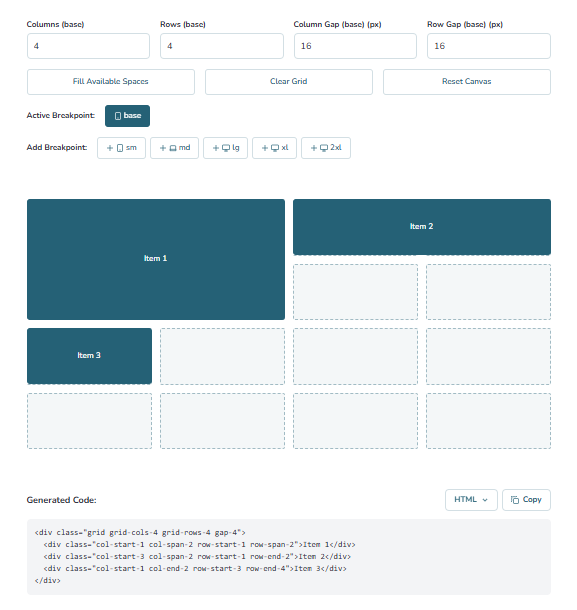
What is Tailwind CSS Grid Generator?
Tailwind CSS Grid Generator is a free, intuitive tool that allows you to create responsive CSS grids quickly. You can customize columns, rows, gaps, and grid items without manually writing CSS code.
The generator is lightweight, easy to use, and perfect for developers and designers who want to visually design grids for websites, dashboards, or web apps.
With options for responsive breakpoints, drag-and-drop positioning, and adjustable item sizes, this tool helps you create complex layouts effortlessly.
How to Use Tailwind CSS Grid Generator
Using the Tailwind CSS Grid Generator is straightforward. Follow these steps:
- 1.Customize your grid - Set the number of columns, rows, and gaps.
- 2.Add elements - Click the + button or "Add Grid Item" to insert new items.
- 3.Resize elements - Use the handle in the bottom-right corner to adjust item size.
- 4.Reposition elements - Drag and drop items to your desired position.
- 5.Add responsive breakpoints - Adjust grid layout for different screen sizes.
- 6.Copy and paste - Copy the generated HTML or JSX code and integrate it into your project.
Why Use Tailwind CSS Grid Generator?
Tailwind CSS Grid Generator improves workflow and speeds up layout creation. Here’s why developers love it:
- Free and easy to use online.
- Intuitive drag-and-drop interface for building grids visually.
- Fully responsive and customizable for any project.
- Copy HTML or JSX directly for quick integration.
- Perfect for websites, dashboards, apps, and prototypes.
Frequently Asked Questions
Get answers to common questions about using Tailwind CSS grids and customizing layouts.
Yes! The tool is completely free to use with no signup or registration required.
Absolutely. You can adjust columns, row spans, gaps, and breakpoints to fit your design needs.
Yes, the generator lets you define different grid settings for mobile, tablet, and desktop using Tailwind’s responsive classes.
Of course! You can copy the Tailwind CSS code instantly and paste it directly into your project.
No coding skills are required. Simply adjust the settings visually and copy the generated code.
Yes, the generated code works seamlessly with your existing Tailwind classes.
Absolutely! You can create anything from basic two-column layouts to advanced multi-row, multi-column designs.
No, the tool requires an internet connection to generate the Tailwind CSS code in real-time.