Introduction
Buttons are the heartbeat of user interaction. From primary CTAs to subtle ghost links, a well-designed button can boost clicks, guide users, and keep your UI feeling polished and professional.
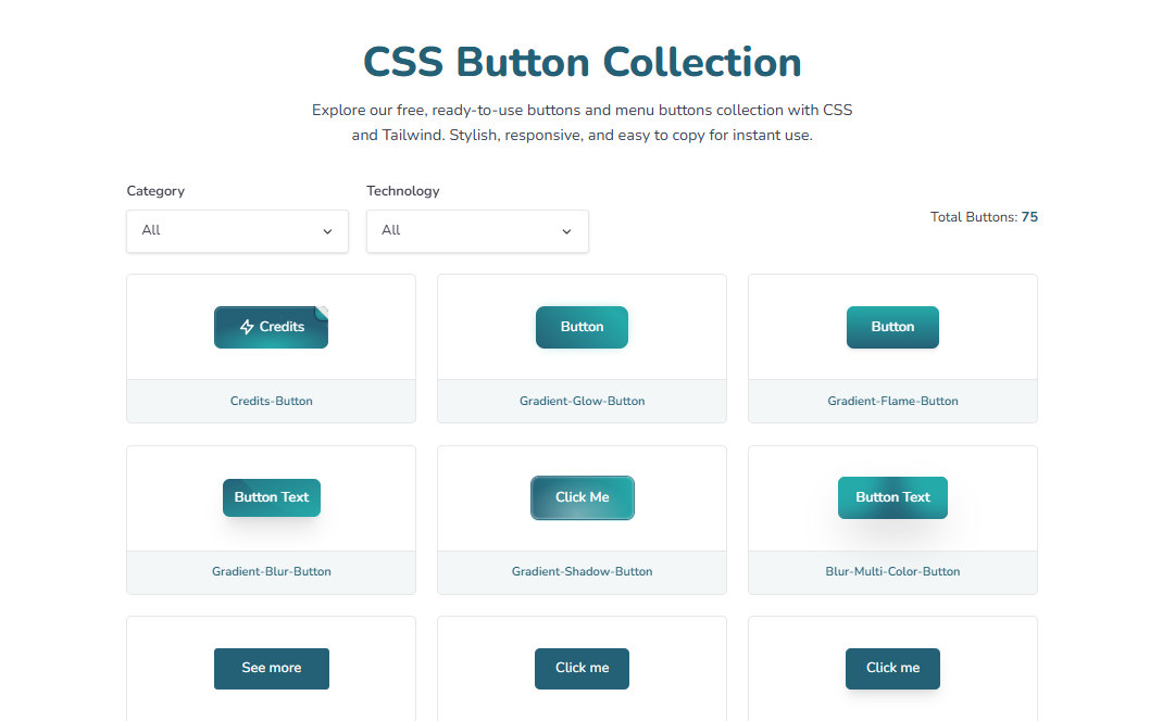
Themedevhub's CSS Button Collection is a free, browser-based tool that lets you browse, customize, and copy production-ready button styles—no heavy setup, no fuss.
Key Features
- Wide Style Library: Solid, outline, ghost, gradient, glassmorphism, neumorphic, pill, icon buttons, and more.
- One-Click Copy: Grab clean HTML/CSS (and Tailwind variants where available) in a single click.
- Custom Controls: Tweak radius, padding, font weight, borders, shadows, and hover/active states.
- Responsive by Default: Sizes and spacing scale gracefully across viewports.
- Framework-Friendly: Works with plain HTML/CSS or frameworks like React, Next.js, Vue, and Angular.
- Performance-First: Pure CSS effects—no JavaScript required for hover/press animations.
- Free for Commercial Use: Use them in client and product work without attribution.
How to Use
- Open the Tool: Visit the CSS Button Collection.
- Pick a Style: Browse categories (Primary, Ghost, Gradient, Icon, etc.).
- Customize: Adjust size, radius, border, shadow, and hover transitions to match your brand.
- Copy the Code: Copy HTML/CSS (or Tailwind class string) straight to your clipboard.
- Integrate: Paste into your project. Optionally extract variables (e.g., colors) to your design tokens.
Why Use CSS Buttons?
- Clarity & Conversion: Clear visual hierarchy increases click-through and reduces friction.
- Consistency: Reusable styles keep your UI coherent across pages and components.
- Accessibility: Focus states and contrast-safe palettes improve keyboard and screen-reader UX.
- Design Velocity: Start from proven patterns and ship faster with fewer regressions.
Popular Button Types Included
- Primary & Secondary: High-contrast CTAs with smooth hover/active transitions.
- Outline & Ghost: Minimal styles for secondary actions and toolbars.
- Gradient & Glassmorphism: Trendy visuals with subtle depth and sheen.
- Neumorphic: Soft-shadowed, tactile buttons for playful interfaces.
- Icon & Icon-Label: Lucide/Material-friendly spacing and alignment.
- Loading/Disabled States: Built-in spinners and dimmed interactions.
Tips for Best Results
- Use Design Tokens: Map colors, radius, and spacing to variables for easy theming.
- Respect Contrast: Aim for WCAG AA/AAA where possible.
- Mind Motion: Keep transition durations between
150ms–300msfor snappy feedback. - State Completeness: Define
:hover,:active,:focus-visible, and:disabled.
Conclusion
Themedevhub's CSS Button Collection helps you ship beautiful, consistent, and accessible buttons—fast. Browse curated styles, customize them to your brand, and paste clean code straight into your project.
👉 Ready to level up your CTAs? Explore the CSS Button Collection and start building delightful interactions today!