Introduction
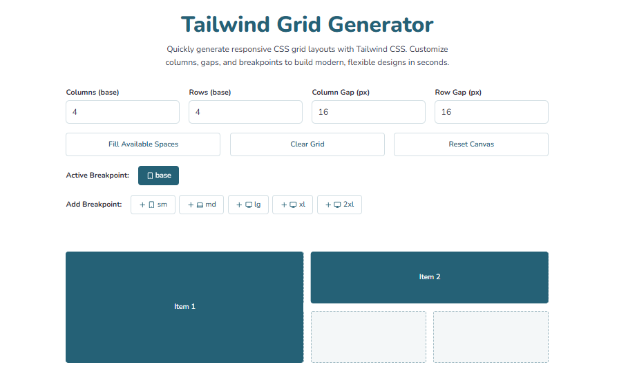
Building responsive grid layouts can be challenging, especially when using utility-first frameworks like Tailwind CSS. Manually writing classes for columns, rows, and gaps can be time-consuming and error-prone.
Themedevhub's Tailwind Grid Generator is a free, browser-based tool that simplifies this process. It allows you to create flexible, responsive grids effortlessly and generates ready-to-use Tailwind CSS code for your project.
Key Features
- Responsive Layouts: Create grids for different screen sizes using Tailwind's responsive classes (
sm,md,lg,xl,2xl). - Customizable Grids: Adjust the number of columns, rows, and gaps to suit your design.
- Instant Code Generation: Copy the generated HTML and Tailwind CSS classes instantly.
- User-Friendly Interface: No sign-up or installation required; everything runs in your browser.
- Free for Everyone: Use in personal and commercial projects without restriction.
How to Use
- Open the Tailwind Grid Generator in your browser.
- Select the number of columns and rows for your grid.
- Adjust gaps and spacing as needed.
- Set responsive breakpoints for different screen sizes.
- Copy the generated HTML and Tailwind classes into your project.
Why Use Tailwind Grid Generator?
- Saves Time: No more manual calculations for grid layouts.
- Precision: Fine-tune columns, rows, and spacing visually.
- Easy Integration: Generated classes work seamlessly with Tailwind CSS projects.
- Responsive by Default: Ensures layouts look great on all devices.
Conclusion
Themedevhub's Tailwind Grid Generator is an essential tool for frontend developers and designers working with Tailwind CSS. With an intuitive interface, live customization, and instant code output, building responsive grids has never been easier.
🔗 Try the Tailwind Grid Generator Now and streamline your layout workflow!